A menu is part of the first conversation
Before a guest tastes anything, the menu begins to explain what kind of meal lies ahead. A short card may suggest a focused selection; a large booklet can signal that there is more to explore. Neither format is inherently better. What matters is whether the menu helps guests understand their options without making the decision feel like work.
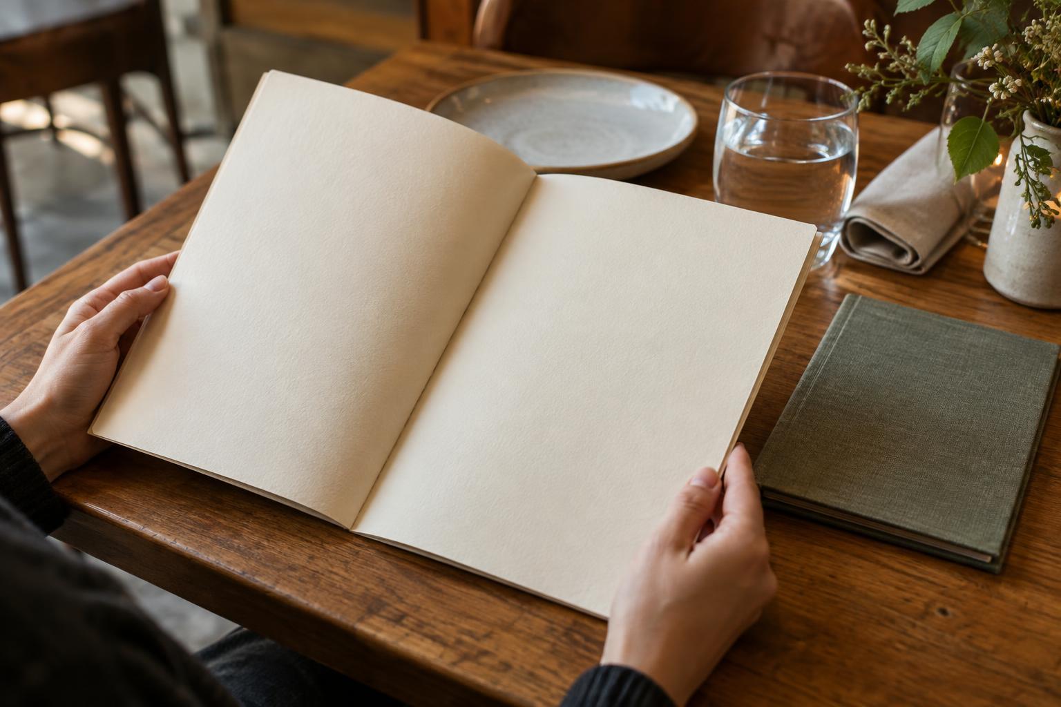
The physical act of opening, holding or sharing a menu also affects the table. A single large sheet may be easy to scan but awkward beside several place settings. A small card leaves room for plates and glasses, though compact type can make it difficult to read. These details are easy to overlook during design and hard to ignore when dining.
Layout can make choices clearer
Guests often need to answer a few basic questions: What kinds of dishes are available? Which can make a meal, and which are intended to accompany one? Where are the prices and useful descriptions? Clear grouping lets people find those answers without decoding the restaurant’s intentions. Sections can be simple, such as starters, mains and sides, or organized around how dishes are meant to be shared.
Visual emphasis deserves restraint. If every dish has a border, symbol or prominent description, nothing stands out. Spacing and consistent type can do more useful work than decoration. Descriptions are most helpful when they clarify an unfamiliar ingredient, preparation or portion rather than repeat broad praise. A guest deciding between two dishes benefits more from knowing what is in them than from being told that both are delicious.
A menu can guide without dictating. Some guests know what they want immediately; others need time to compare or a chance to ask a server. A clear layout supports both approaches and leaves room for the human conversation that a printed page cannot replace.
Materials need to suit the room
Menu materials carry practical trade-offs. A loose paper sheet is straightforward to replace when dishes change, but it can crease or stain during service. A heavier card may feel sturdy and stay flat on the table, though updating it may take more effort. A protective cover can withstand repeated handling, but its surface may catch glare under certain lights. The best choice depends on how often the menu changes and how guests use the space.
Texture and weight also contribute to the impression a menu makes, but they should not come at the expense of function. A beautiful cover is less useful if it is cumbersome to hold or hides the page inside. For a broader look at how materials and usability shape familiar objects, browse Product Design · Making and Materials. In a restaurant, the practical test is whether the menu remains comfortable to handle through an ordinary meal.
Readability and upkeep are hospitality
A menu that is easy to read helps guests make choices with less strain. Type size, contrast, line spacing and lighting work together: text that looks clear in a bright workspace may be harder to read at a dim table. Keeping essential details legible is particularly important when a menu uses a small format. If information is offered in another format, guests should be able to request it without feeling that they are causing a problem.
Accuracy matters as much as appearance. A stained page, an outdated price or a description that no longer matches the dish can interrupt trust, even if the rest of the menu is carefully designed. Restaurants with frequently changing offerings may choose a format that is easy to revise; those with a steadier selection can focus on durability. Either way, checking menus as part of service preparation helps keep the object aligned with what the kitchen can actually serve.
The most effective physical menu rarely calls attention to its own cleverness. It fits the table, makes choices understandable and stays useful as the meal unfolds. When those small decisions are handled well, guests can spend less time navigating the page and more time enjoying the company and food in front of them.